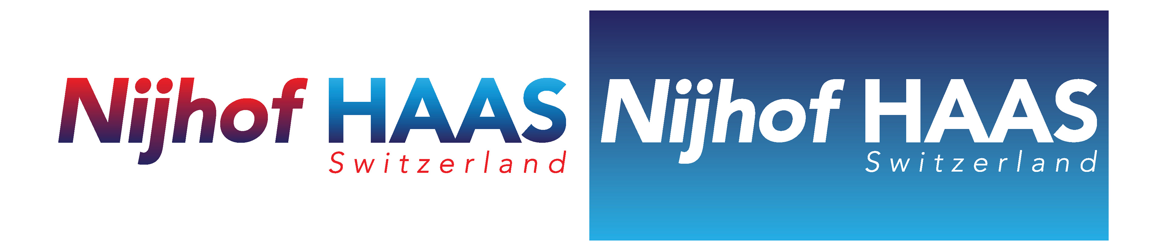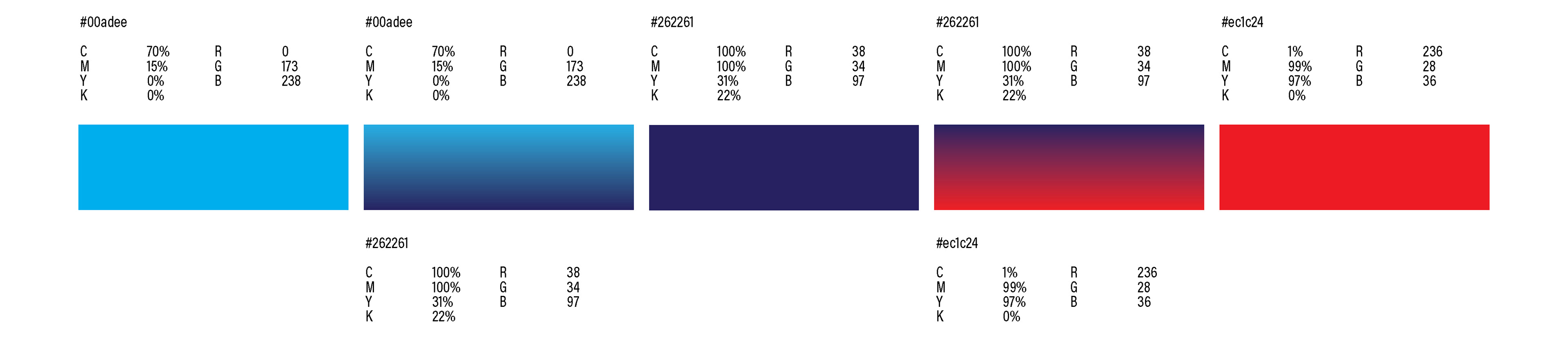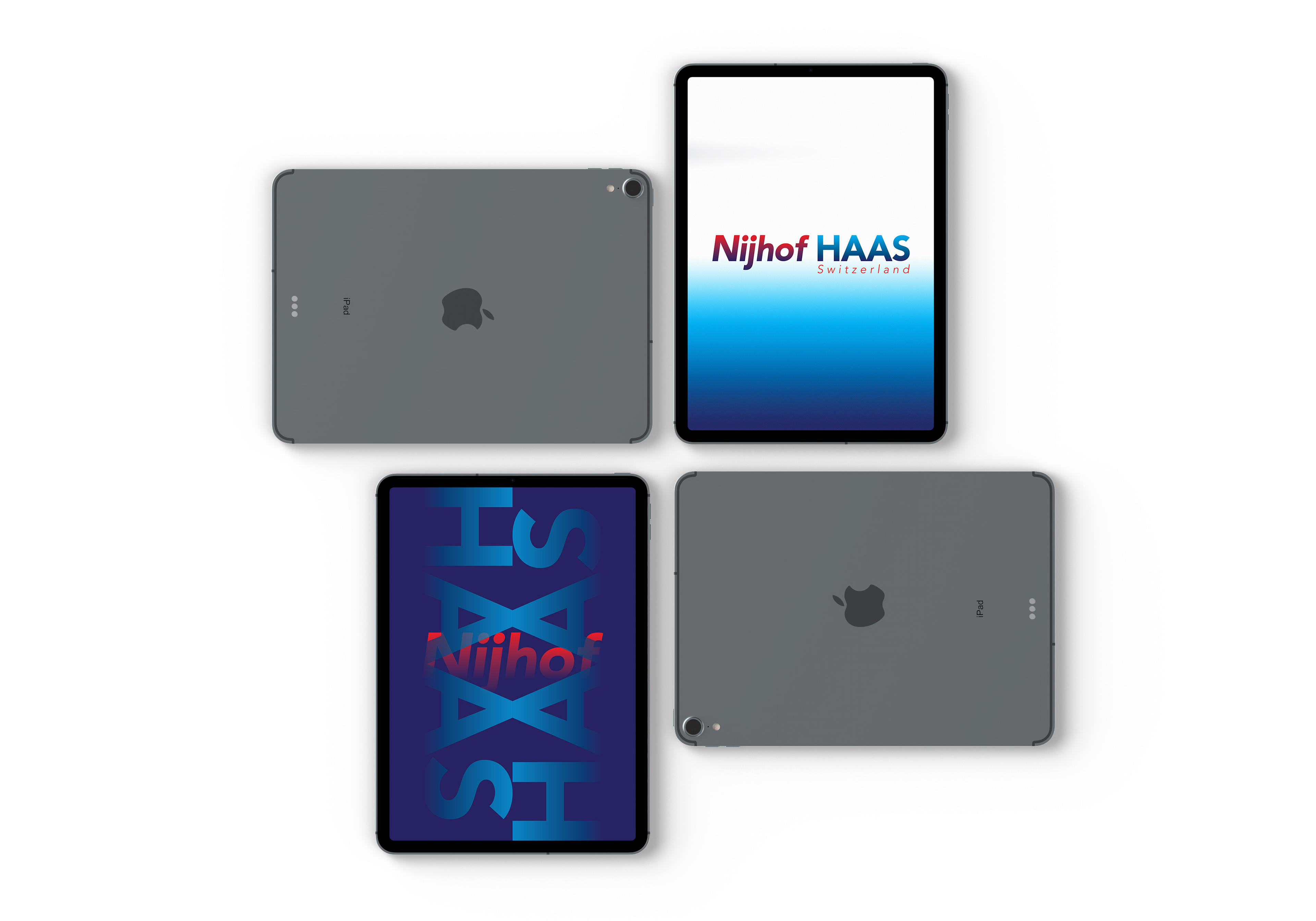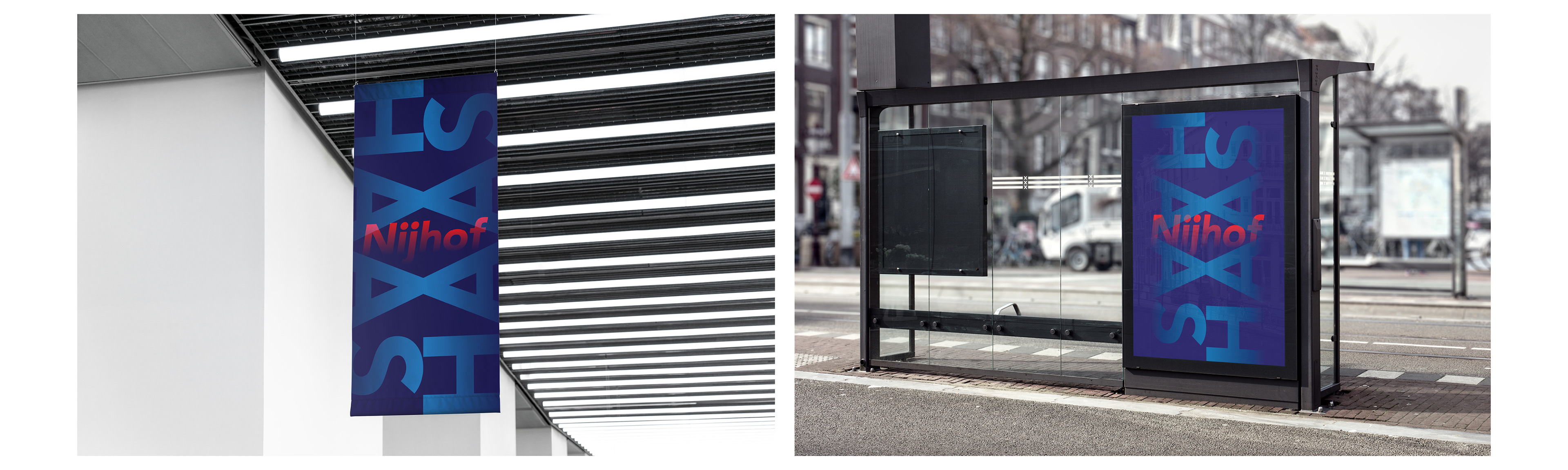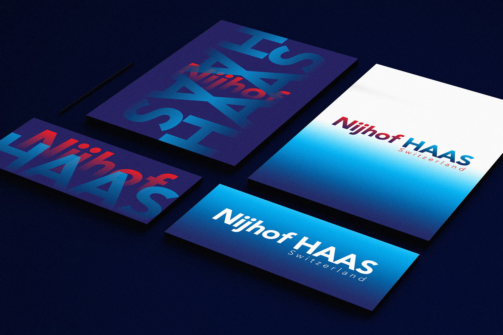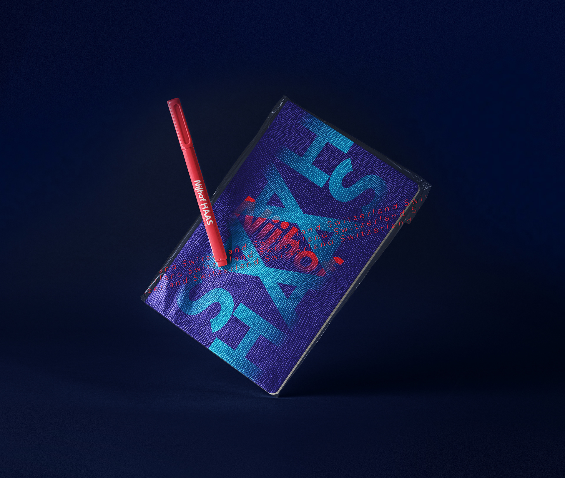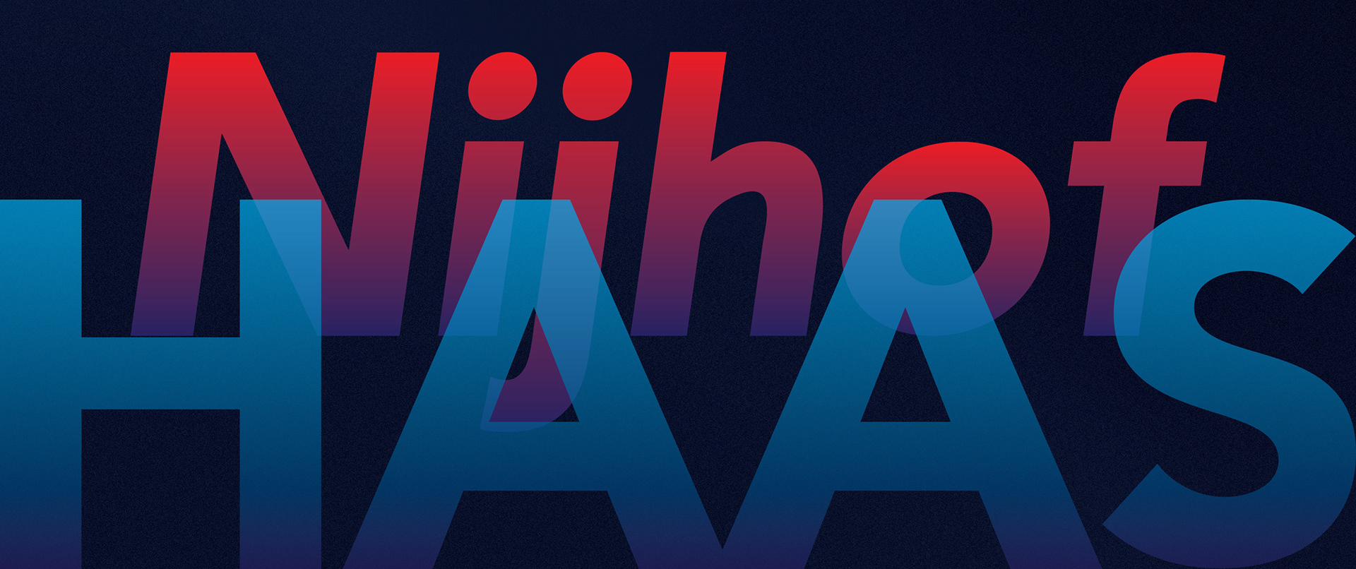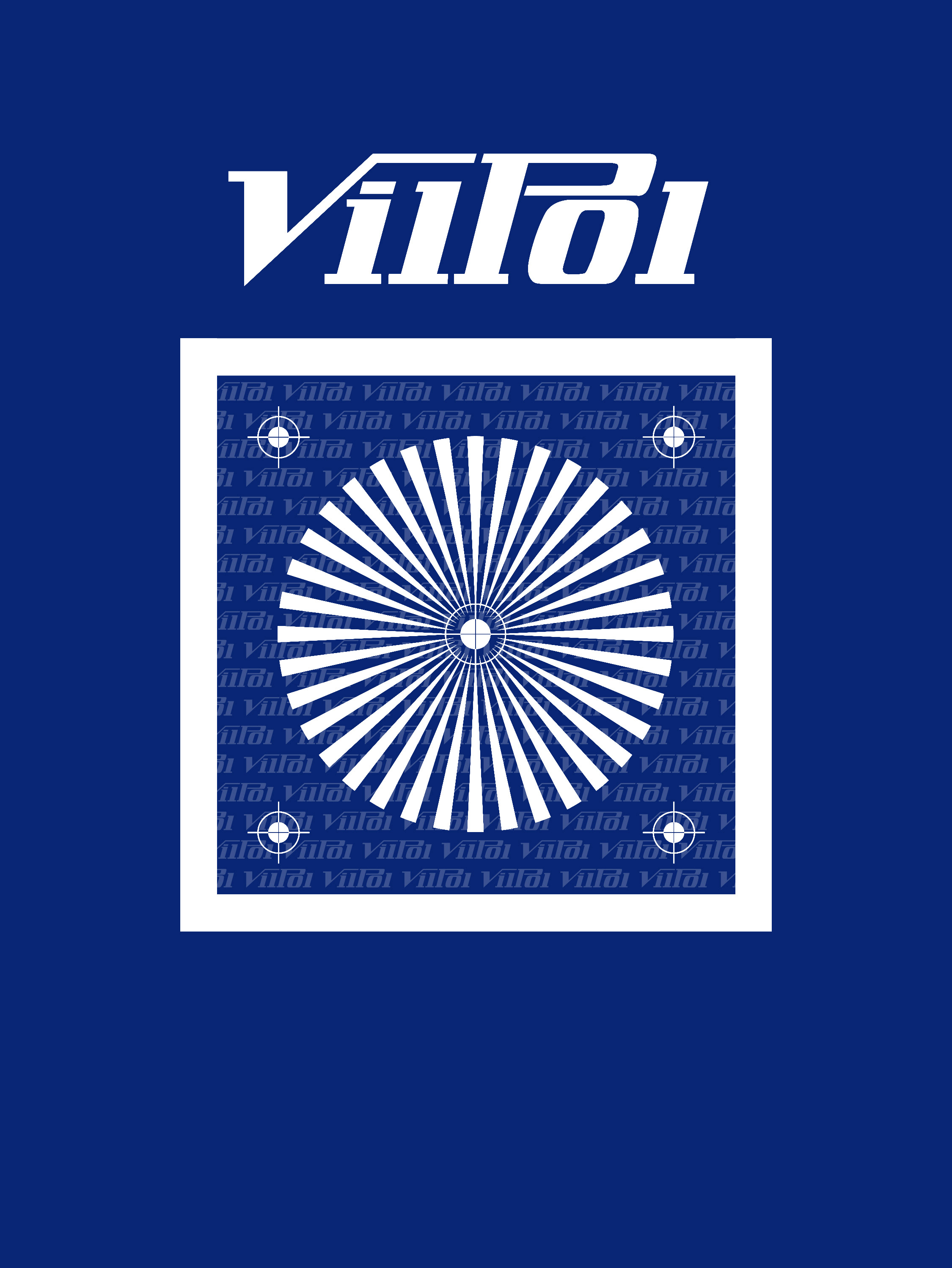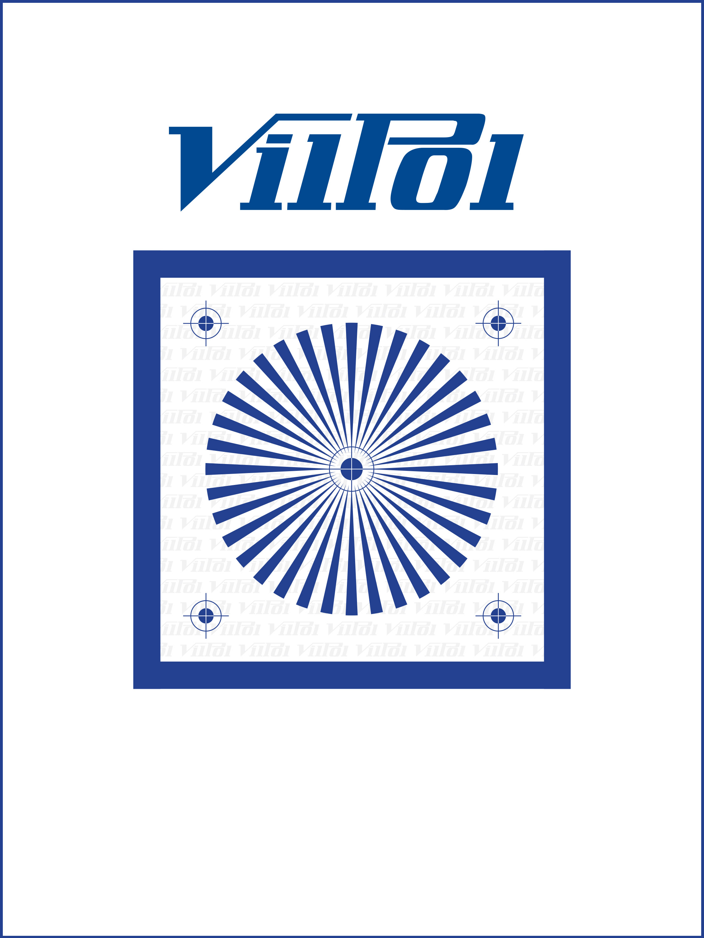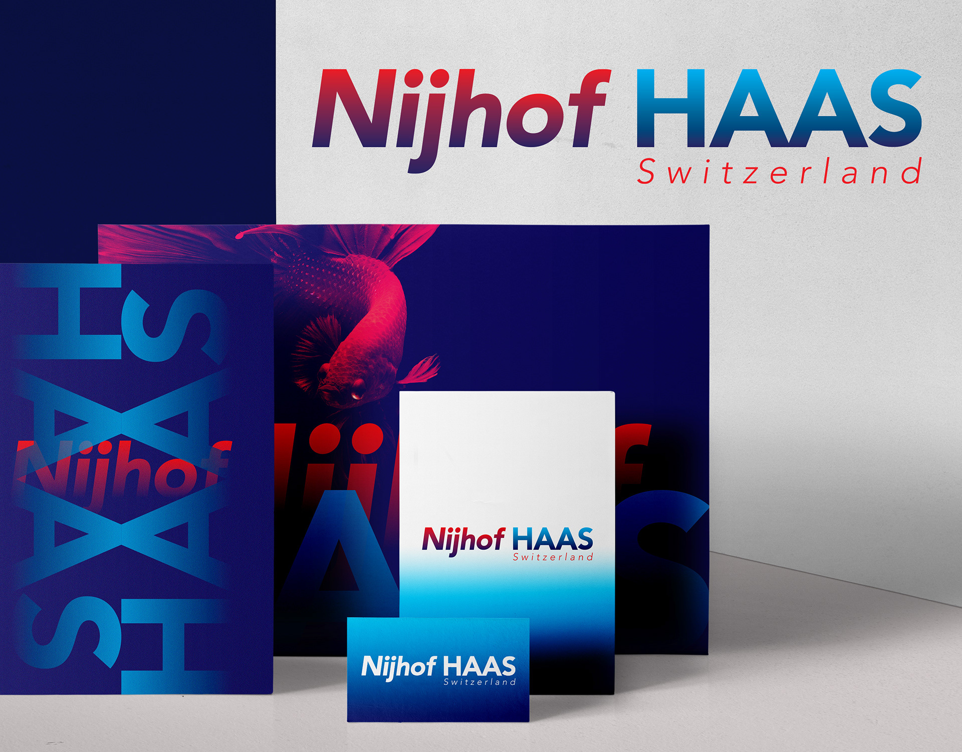
The task was to design a coherent visual identity for a company from the water engineering sector. Our inspiration and also the starting point was element of water. That's why we decided to use shades of blue. We chose two shades - light and dark. In this way, we wanted to refer to shallow and deep waters. Red appeared as a symbol of the strength of the element of water. This color is in the complete opposite and at the same time best illustrates strength. It clearly creates the image of the entire company.